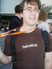
 Take a look at all the geeky people at sxsw and look I'm one of them as well!. It did seem that fewer people were wearing geeky t-shirts then last year. I mean if your not going to wear them at sxsw when are you going to wear them?
John Gruber does not seem impressed with sxsw either
John Gruber does not seem impressed with sxsw either. “But the nebulous nature of art puts more emphasis on the need for speakers to add structure, clarity, and preparation to their presentations.” How do I not fall in love with that quote?
I did not know I was in such good company in sxsw disappointment. If so many people think this lowly about sxsw 2007 I would not be surprised if attendance drops next year. A conference can't run on parties alone.
Khoi Vinh talk about how panels in general are a bad idea
Khoi Vinh talk about how panels in general are a bad idea. He is much more polite about it then I'm willing to be.
SXSW: Dave Shea (Hypocrite)
Here's a choice quote from Dave Shea at SXSW:
“I don't like looking at web pages in print”
I'm so glad that Dave has such a high brow view of print design. If you like to learn more you can read his book The Zen of CSS Design: Visual Enlightenment for the Web where every single page has a website on it.
While Dave Shea is above looking at websites in a book he's not above trying to sell them to the masses. I'm so glad I bought his book now. I want a refund.
SXSW Review: Going Downhill?
There are a lot of things wrong with SXSW and a lot of reason why. SXSW used to be a tiny design and technology conference amidst a giant music festival. Today SXSW is as twice as large as the year before and show no sign of slowing down.
In the early days of SXSW the fight for standards based design was just starting and there was a lot of headway to make. People needed to be taught and great panels grew out of the people's need to learn.
Today the web standards war has been won. With most web designers having a grasp on css it was finally the time for SXSW to turn design away from the technical and back to design principles, but that is not what happened.
The old standaristas are not prepared to teach design. But instead of moving on they continue to come back at put on fluff panels wit little substance. SXSW continues to allow it cause the internet famous panelists are who bring in the attendants.
I could pick on many panels but the worst of the bunch was: Design Workflows at Work: How Top Designers Work Their Magic. It's interesting to read about the panels talk about how they really did not prepare for the panel. The description was:
Have you ever wondered how the top designers work their magic? What is their workflow? What tools and techniques work best for them as they create compelling and inspiring designs. Find out the workflows that work best in today's fast paced environments. Get tips and best practices as true 'Design Superheroes' share their craft.
Right of the bat the description does not sound that great. Though all of the panelists are excilent designers any one who actually works on the web can't possibly believe that the "top designers" have some sort of magic workflow.
Never the less this panel got such a large response that SXSW put the panel in on of the largest rooms. Since these same top designers made SXSW famous they have such a large following that it almost does not matter what panel they would want to put on.
The panel turn out to be four panelists talking about how they like to think in the shower or how much they love basecamp. Endless talks about what time they wake up and go to sleep. The panel ran as an impromptu talk between four friends with people stepping on each other's words and little direction. The entire panel was a train wreck.
Anything worthwhile that came out of the panel was by complete accident and was definitely not by design. But while the panel had no substance it had a lot of glamor with beautifully designed slides (though with no information on them) and an entire site to go along with their panel. The site has more info then the panel but that's not an accomplishment of any sort.
While all the panelists are not only accomplished designers but time proven bloggers they need to all stop joining panels. If this panel is any proof they have nothing interesting or helpful to say and are only trumping other less known designers who might have something to teach.
This is not the only panel to waste people's time. At least they tried to warn people that Bullet Tooth Web Design: Plan Your Web Site like Pulling off a Robbery was a complete waste of time.
Last year I bashed How to be a web design superhero and Andy Budd bashed me back. I still argue that people come to conferences and go to panels to learn. Learning is what companies are paying for. SXSW is also popular for the parties afterwards and I know I would feel better about parting if I felt like my brain was so full of new information that only an open bar can fix it.