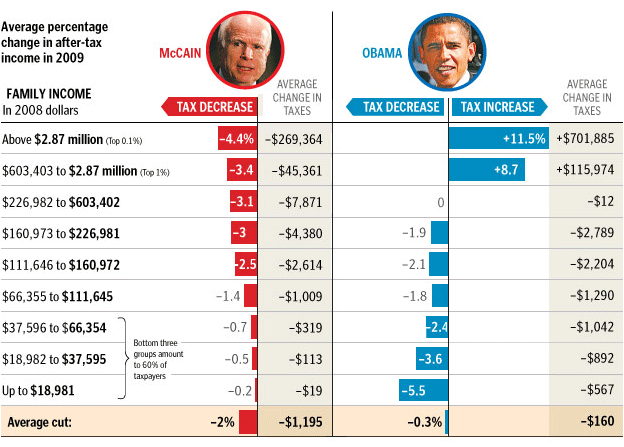
This is a good breakdown of Obama and McCain’s tax cuts. Are those tax brackets though? It doesn’t seem like it.
Either way the one bias the graphic has that I can see is the “average” at the bottom. Average of what? The bottom 60% has as much weight at the top 1% that makes no sense.
Lets refactor the averages and exclude the top 1% and I think we’ll get something that is a bit closer to a fair look at an average. A real average would have to take the population of each segment in to account but I think that math is beyond me.
After you remove the top 1% these are the new numbers are Obama gives an average 2.5% cut and McCain gives a 1.6% cut. While the numbers are close McCain’s cut clearly skew to the riches people while Obama’s skew to the poorest.
