
Vimeo has gone through on of the most extensive redesigns I can remember in a while. Google analytics was large, Upcoming's was moderate and youtube been focusing on one small change at a time. Vimeo seems to have really dug their teeth in and redesigned their user interface from scratch.
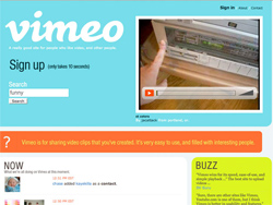 Vimeo was not slouch to begin with either. It was a nice looking site with a quirky variant of the web 2.0 look. One of the most striking things about the redesign is the color change. Formally a white on sea foam green with orange and yellow high lights they moved to a much more reserved dark brown on tan with much more muted highlights of orange and yellow.
That color shift alone is an interesting choice. Most times companies retain their color pallet though design changes. Why did they choose such a dramatic color shift? I personally feel they move to a more muted pallet to seem more gender neutral. Being a niche video site they can't have people avoiding their service because of it's color pallet.
 Color alone is not the only shocking changes Vimeo has tried. One thing that seems extremely odd is the alignment of the main column. Why in the world is it a full 20px higher then everything else? My best guess is to bring prominence to sections such as your inbox and registration. Despite that logic on first glance it just seems like a mistake and even today it still does not look correct to me.
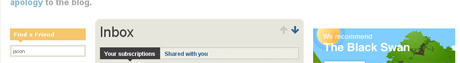
 Vimeo has also chosen a very unique navigation and icon set. The pagination seems unconnected to the content it is supposed to be effecting. The ability to type in the page number saves the space of listing all the pages and the previous/next arrows do not look like buttons. The icons share the button-less look.
This kind of interface might be very off putting to the average web user and I'm sure Jakob Nielsen would disapprove but I truly believe it's not only visually appealing but wonderfully quirky interface that is perfectly usable and a adds to the quirky flavor of Vimeo. I'm a strong believer in challenging users to raise to the challenge to new an innovative interfaces. If you respect the intelligence of the user I fully expect them to raise to the challenge.
 These top and bottom links also seem a bit out of place. With no scroll bar on the content you are going from top to bottom of it seems like there is little indication of what those links do. Once again this is a daring choice that I think will work out as additional Vimeo quirkiness.
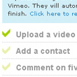 I'm a big fan of the "How to Get Started" box. Kathy Sierra would be very proud of their list of small goals with positive feedback. There is tons of money to be made with adding more game like features to a site. People play good games for hours and web sites can greatly benefit for their methodologies. Vimeo started with a very small implementation but hopefully they will see great value come from this little feature and expand it in the future.
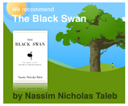 I can't remember what kind of ads Vimeo had before but their new ads look great. At first I was surprised they were convincing advertisers to go with Vimeo's in house ads. Most advertisers would not bend to make their ads special for just any site. Quickly you see that each ad is a simple amazon affiliate link. While this lets them design their own ads I can't imagine it's very profitable. Amazon affiliate links have historically not performed well and so it's an odd choice although a visually appealing choice.
Vimeo has pulled off an awesome redesign. It's gone from a visually appealing site to visual appealing site with some daring interface choices. Just as apple is an experience company Vimeo seem to be pioneering their own unique user experience. This kind of respect for their users will only create a greater dedication to their service as it seems more personal then most other sites.